Overview
Verizon offers so much more than phones and internet
Fleet management. Cybersecurity. Cloud storage. Mobile device management. Business productivity tools. Verizon's business portfolio is enormous — but most small business customers walking into a store have no idea. And neither, effectively, do the sales reps serving them.
When customers walk in, reps default to phones and internet — the products they know. Everything else goes unmentioned. That means missed sales opportunities for Verizon, and unmet needs for business customers who could genuinely benefit from more.
How might we help Verizon sales reps effectively recommend relevant solutions for small business customers, based on their unique needs and goals?
Project goals
01
Increase Verizon's business sales by uncovering and meeting more customer needs
02
Reduce customer in-store time by streamlining the discovery and solution process
03
Boost cross-selling opportunities by introducing relevant services beyond phones and internet
04
Empower frontline sales reps with the knowledge and tools to handle business customers confidently
Research · Interviews
Understanding the gaps in the current discovery process
To uncover challenges in how Verizon serves its business customers, we conducted interviews with store sales representatives, business representatives, and account managers.
22
Interviews conducted with sales reps, business reps, and account managers
Key insights from interviews
01
Retail reps often only suggest network solutions — internet and phones.
02
Business sales reps reach out to MSAs (Master Solution Architects) for solutions above network level.
03
On average, it takes 52 minutes for a business customer to walk out of the store with a solution.
04
Retail sales reps are not equipped to handle a business customer's full range of needs.
What's stopping reps from selling beyond phones and internet?
Root causes
Low Confidence & Fear of Error
Lack of Product Knowledge
What reps said
I'm just nervous to sell anything beyond internet and phones.
I don't feel confident explaining complex business solutions.
There are too many products, and it's hard to keep up.
How do I know which product is the right fit for them?
Understanding the "why" behind sales reps not suggesting other solutions was the most important part — it revealed underlying knowledge gaps, confidence issues, and structural barriers.
Research · Observations
Seeing the gaps firsthand
To see the gaps firsthand, we observed how business customers were handled in real time, from the first greeting to the final handoff.
06
In-store observation sessions conducted
01
Reps mostly sold phones and internet — rarely suggested full business solutions.
02
For complex needs, reps submitted leads to MSAs — causing delays and drop-offs.
03
Many customers didn't know Verizon offered tools like Google Workspace or fleet management.
04
Reps used iPads with tools like Artemis and Salesforce for lead generation and note-taking.
Synthesis
Making sense of the data
We used affinity mapping to organise insights from interviews and observations. By grouping similar quotes and behaviours, we uncovered key themes around sales rep hesitation, knowledge gaps, and missed opportunities in customer engagement.
Affinity mapping helped us make sense of a large volume of qualitative data by clustering similar insights together. It allowed us to spot recurring patterns across interviews and observations, revealing the root causes behind sales rep hesitation and gaps in the current discovery process.
Design decision
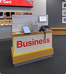
Why iPad?
We were initially torn between designing our solution for a kiosk or an iPad. Both had their pros and cons, so we turned to the people who would use it most — the sales reps. Their feedback was clear and unanimous: they preferred the iPad. It fit seamlessly into their existing workflow and felt natural in conversation with customers.

iPad — preferred by sales reps

Kiosk — considered but rejected
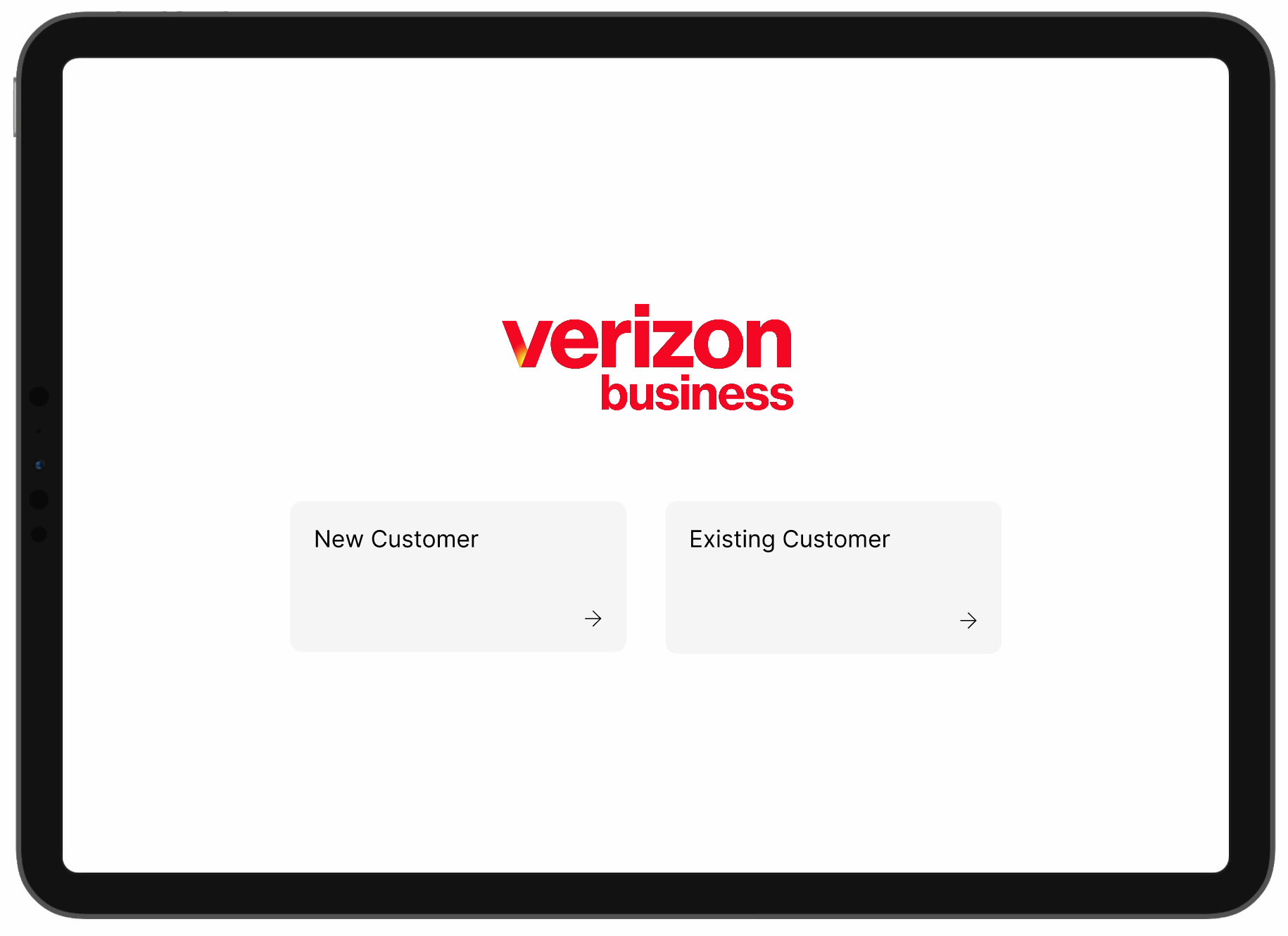
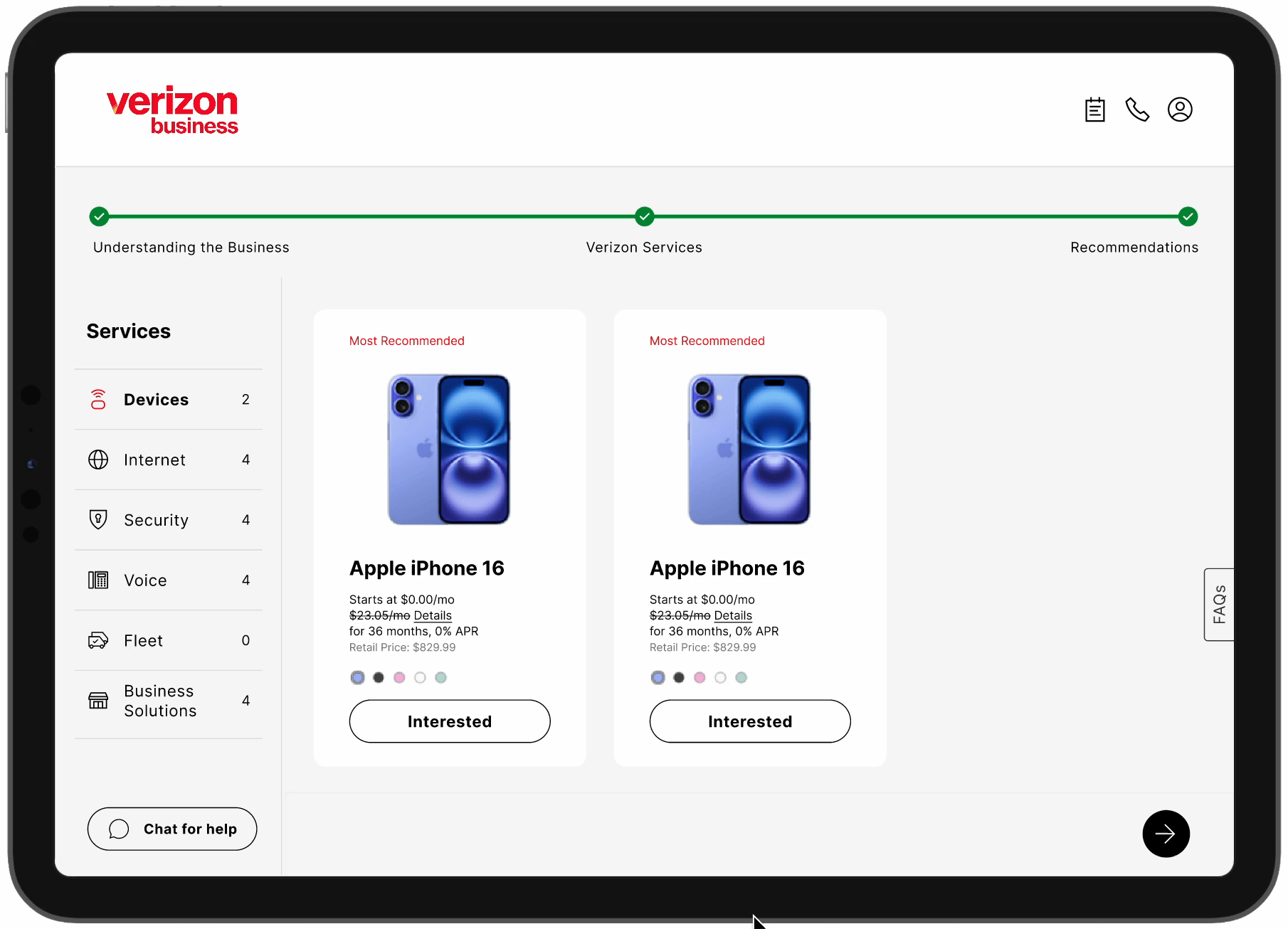
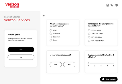
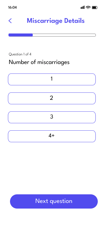
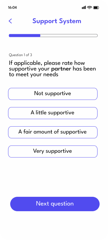
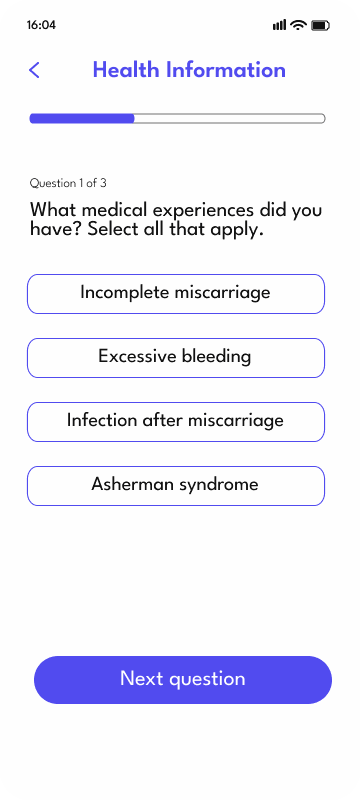
Solution
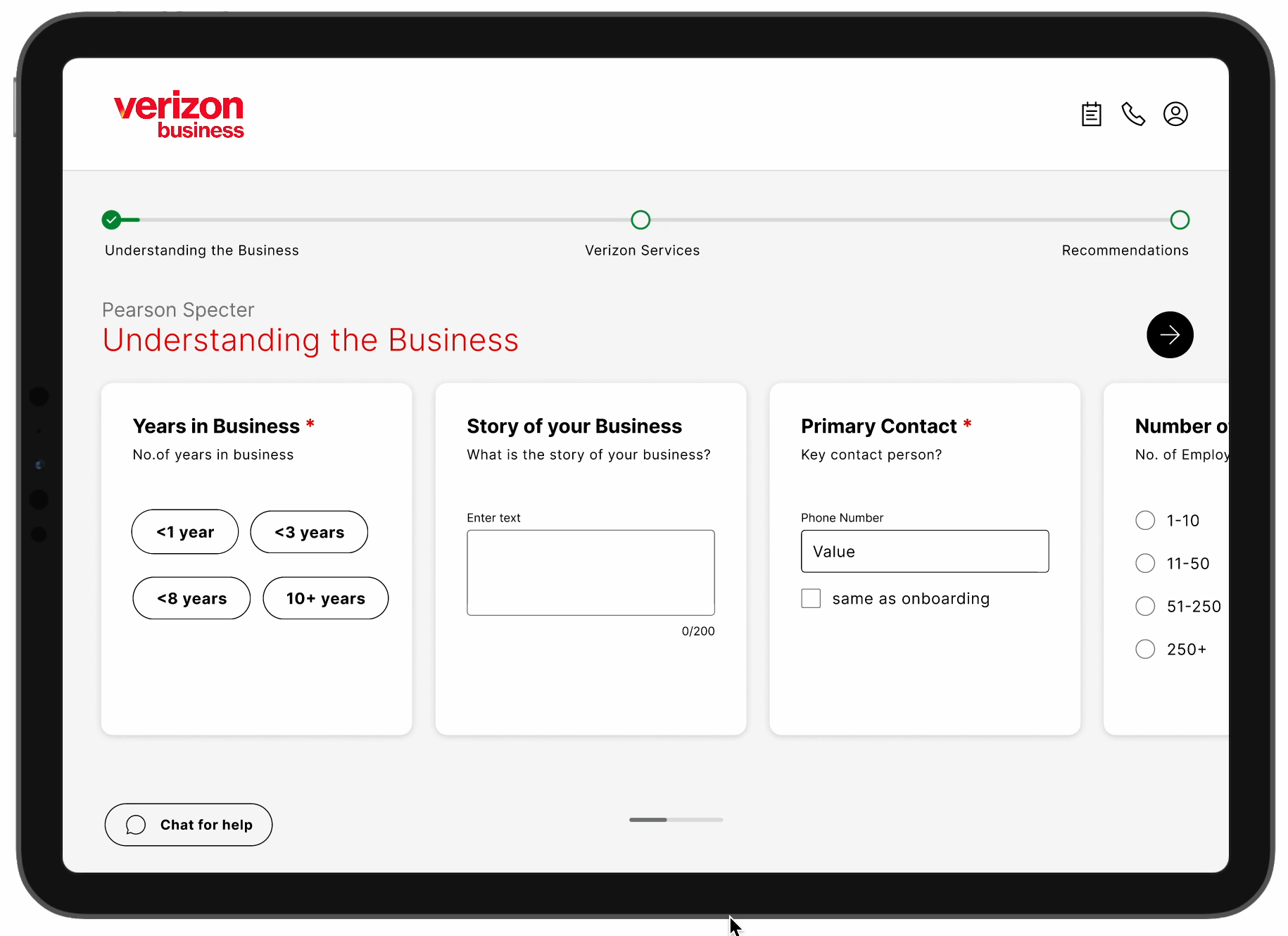
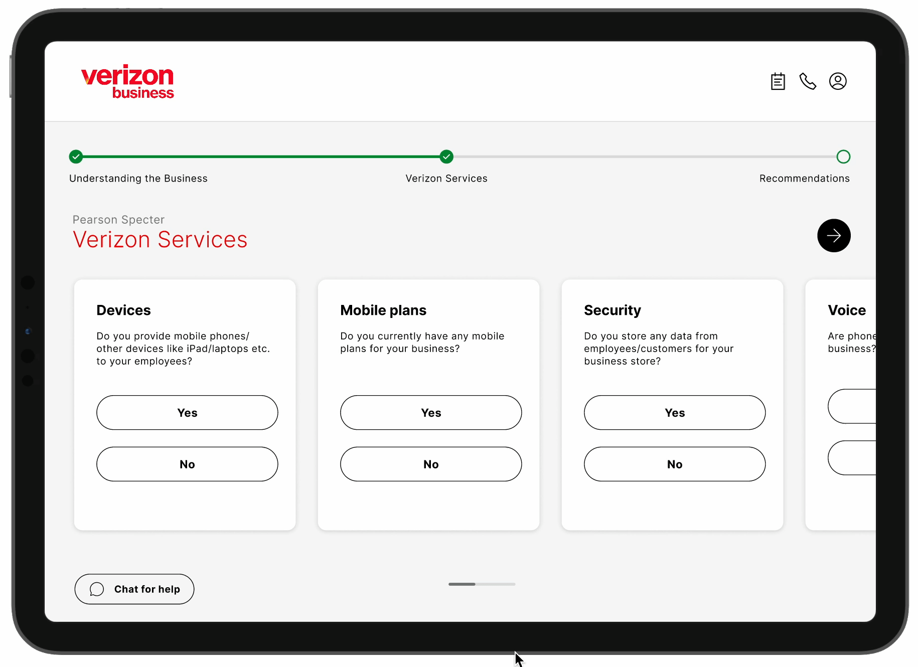
An iPad tool that listens and recommends
An iPad-based tool that helps sales representatives capture customer needs during in-store conversations and instantly generates personalised product recommendations tailored to each business customer's unique situation.
Current in-store flow
Business customer walks in
→
Rep only suggests phones & internet. Others referred to business rep
→
Business rep refers to MSA for complex solutions
→
MSA handles all customer needs
→
Customer makes a purchase
Proposed flow with iPad solution
Business customer walks in
→
Rep is equipped to handle all needs using the iPad solution
→
Customer makes a purchase
Design process
From architecture to prototype
We kicked things off by mapping out the information architecture to get a clear structure in place. Then moved to paper sketches to quickly explore ideas and get everyone aligned before committing to pixels.
Information architecture
Paper sketches
Keeping things low-fi helped us iterate quickly and gather early feedback without getting caught up in details.
Final prototype
The solution in action
Evaluation
Testing with real users
To assess effectiveness and usability, we conducted both concept testing with Verizon stakeholders and usability testing with the people who would actually use it day-to-day.
02
Concept testing sessions
with Verizon stakeholders
11
Usability testing sessions
with sales and business reps
What users loved ✓
- → Ease of use — accessible even for new reps
- → Clear product recommendations for faster decisions
- → Support for cross-selling beyond phones and internet
- → Send to MSA option reducing handoff delays
- → FAQ section for quick customer questions
What could improve
- → Replace generic labels with Verizon-specific terminology
- → Opportunity to incorporate Verizon's in-house AI for dynamic personalisation
Iterations
What we changed based on testing
Button placement for follow-up questions
During testing, users had trouble finding the Next button on the left side — it caused confusion and slowed them down. Moving it to the right, where people naturally expect it, made the flow immediately smoother.
Before
After

UX copy refinement
We refined the UX copy to better align with Verizon's internal language. Generic terms like "Internet" and "Marketplace" created confusion — replacing them with Verizon-specific terminology reduced hesitation and improved trust.
Before

After

What users said
The reception
Users loved the solution — it was well received across every rep we tested with.
"This system is way better than what we currently have — it's more intuitive and much easier to use."
Sales Rep
"Using this product, I can keep the conversation with customers completely natural — it doesn't feel forced at all."
Business Rep
Impact
Measurable outcomes
10 min
In-store time — down from 52 minutes
72
NPS score received from usability testing
35%
Projected increase in Verizon Business sales
↑
Boosted product awareness for both reps and customers
Key challenge
Keeping it human
One key challenge was preserving the natural conversation between the sales rep and the customer. We didn't want the iPad interface to feel robotic or disrupt the personal connection that makes a good in-store experience.
To keep the flow human and flexible, we designed the experience so reps could jump between suggested questions rather than follow a rigid script. Not all questions were mandatory. Usability testing confirmed that this approach maintained a natural, conversational tone during interactions.
UX Research
User Interviews
Usability Testing
Affinity Mapping
Information Architecture
iPad Design
Figma
Prototyping


.png)
.png)